What are Core Web Vitals & How to Optimize Them
You may have seen Google Search announce an upcoming search ranking change recently that incorporates page experience metrics. These metrics include the Core Web Vitals which, together with a few other signals, paint a pretty holistic picture about the quality of user experiences on a page. But, what are the Core Web Vitals and how do you go about optimizing for them. Well, Core Web Vitals are a set of metrics related to speed, responsiveness, and visual stability.
These three aspects of user experience are measured using three metrics. So first of all, we have Largest Contentful Paint which measures loading performance. Next up, we have First Input Delay which measures interactivity. And last, we've got Cumulative Layout Shift which measures layout stability.
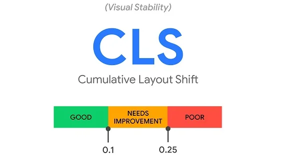
Cumulative Layout Shift or CLS
Now, CLS is a pretty important metric for measuring visual stability because it helps quantify all those times when we see really surprising shifts in the content on a page, and it helps make sure that the page is as delightful as possible.
CLS is the unexpected shifting of webpage elements while the page is still downloading. The kinds of elements that tend to cause shift are fonts, videos, images, contact forms, buttons, and other kinds of content.
What causes poor CLS?
How to Fix CLS Issue?
Always include width and height size attributes on your images and video elements alternatively, you can always do things like reserve the required space with CSS aspect ratio boxes, but, in general, this approach just makes sure that the browser can allocate the correct amount of space in the document while the image is loading.
<style>
img{ aspect-ratio: attr(width) / attr(height); }
</style>
Modern browsers now set the default aspect ratio of images based on an image's width and height attributes. So, it's really valuable to set them up if you want to avoid those layout shifts. This is a change in modern browsers, and it's all thanks to the CSS working group. They've done some work that basically allows us to just set width and height as normal, and this calculates an aspect ratio based on the width and height attributes before the image has loaded. This is something that's added to the default style sheet of all browsers and it calculates aspect ratio based on the element's width and height attributes. So, as long as you're providing width and height, the aspect ratio can be calculated and everything will hopefully avoid layout shifts, so this is a great best practice to be following.
<img width="1000" height="1000"
src="shoe-1000.jpg"

srcset="shoe-1000.jpg 1000w,
shoe-2000.jpg 2000w,
shoe-3000.jpg 3000w"

alt="Shoe"/>
This is also something that works well with responsive images. This is also something that works well with responsive images. With srcset, you're generally defining images that you want to allow the browser to select between, you need to find sizes for those images. To make sure that your image width and height attributes can be set, just make sure that each image is using the same aspect ratio.
Reserve enough space for any of your dynamic content, things like ads or promos. Avoid inserting new content above existing content, unless it's in reaction to a user interaction. You want to make sure that any layout shifts in your page are ones that you are making a conscious decision around and like occur as expected. Many ad networks and publishers will often support dynamic ad sizes and ad sizes that are dynamic are something that can sometimes increase revenue because you're giving people a lot of flexibility around what can go inside there, your ad slots, but it can also be something that can potentially negatively impact the user experience by pushing things down. So, that's something that you want to avoid. So, how do we approach this? Well, one solution to the problem is statically reserving space for the slot. So, you can make sure that you're defining a container for these ads or embed frames so that regardless of what goes inside, you're not shifting the content of the page around.
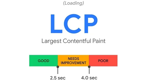
Largest Contentful Paint or LCP
It’s been a bit of a challenge for web developers to measure just how quickly the main content of the webpage loads and is visible to users. Thankfully, we now have metrics like Largest Contentful Paint that are able to report the render time of the largest content element that's visible within the viewport. Now, you might be wondering what causes a poor LCP.
For many sites, images are the largest element in view when the page is finished loading, especially as UX patterns have shifted towards us, using more hero images on our pages. So, it's very, very important to optimize our images, especially anything that's visible within the initial viewport.
Now, there are a few techniques that you can use here. You can consider not having an image in the first place, if it's not that relevant, maybe you remove it. Compress those images, use, you know, there are plenty of image optimization tools out there. Maybe consider converting them to more efficient modern formats like webp. WebP is a modern image format that provides superior lossless and lossy compression for images on the web. Using WebP, webmasters and web developers can create smaller, richer images that make the web faster. WebP lossless images are 26% smaller in size compared to PNGs. Also use responsive images.
You can also consider using an image CDN. I'm seeing an increasing number of sites leveraging image CDNs just to help them get control over an ability to just tweak parameters in a URL for an image and change what format gets served down or what quality you have. Using an image CDN can be a really good way of staying on top of modern best practices.
Defer any non-critical JavaScript and CSS to speed up loading the main content of your page. Before a browser can render any content, it needs to parse HTML markup into a DOM tree. Scripts and style sheets can both be render blocking resources, which can delay your First Contentful Paint, consequently, your Largest Contentful Paint as well. So, defer any of your non-critical scripts and style sheets to speed upload. One approach to addressing this problem is by inlining your critical CSS and deferring the load of non-critical styles. We often call this technique critical CSS. Critical CSS is all about extracting CSS for above-the-fold content, making sure that you can render the above-the-fold content as quickly as possible in the first few RTTs and deferring the load of the rest of your style sheets for the page. The longer that it takes a browser to receive content from the server, the longer that it takes to render anything on the screen. The faster a server can respond, that's going to improve every single page-load metric, including LCP.
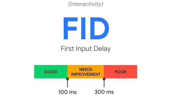
First Input Delay or FID
Now, First Input Delay measures the time from when a user first interacts with a page, so that moment when they start to click on a button or tap some UI, some JavaScript powered control, to the time that the browser is actually able to respond to that interaction. There are many things that cause a poor First Input Delay. There can be:
I would strongly recommend using Lighthouse and using dev tools because they do try to point out areas where you might have long tasks or heavy script execution. Very often the solution is to just break up this work, serve what the user needs when they need it and try to look at opportunities for, you know, minimizing main thread work as much as possible. The end goal is essentially just making sure that the main thread isn't busy and that user interactions are not delayed.


